October 08, 2026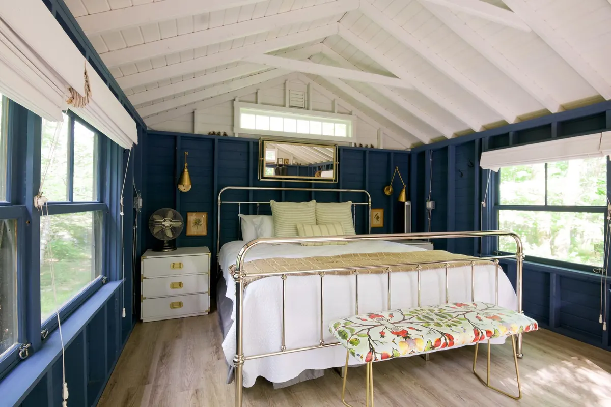
There is a particular kind of quiet on a British beach in February: wet sand, a sky the colour of old pewter, and a horizon that blurs into the sea with no hard line anywhere. That softness is what makes coastal colour work so well indoors. You are not recreating a seaside theme; you are borrowing the coast's light quality — low contrast, muted, cool — and letting it settle a room where you sleep.
Get it right and a bedroom feels calmer, larger and easier to keep tidy. Get it wrong and you end up with something closer to a holiday let: nautical stripes, shells on the shelf, and a blue that turns cold and slightly grey under a British bulb. The difference lies in the tones you pick and the proportions you give them.
Why coastal colours rest the eye
Colour does not need to be strong to be interesting. A bedroom benefits from low contrast at eye level because your eye has less work to do — no bright shapes jumping forward, no competing hues arguing across the room. Outside, nature rarely uses saturated colour on a large scale. Sand, chalk, wet slate, marram grass and sea mist sit within a narrow band of muted tones, and the variation comes from texture rather than hue.
The practical rule is to choose colours with a grey or green undertone rather than a clean, pure blue. Pure blues read as ice and sugar; greyed blues read as sea and sky. Dirty blues, in the best sense, are the ones that settle.
Think of four colours, not forty. The coast is generous with texture and mean with hue.
Pick your coastline before you pick your paint
British coastlines are not all the same colour, and choosing a specific one keeps a scheme coherent. Pick your reference point, then let everything else answer to it.
Chalk and shingle
White cliffs, pale pebbles, hazy summer light. This is the brightest coastal palette: chalky off-white walls, a soft grey with a hint of green, and warm sand in wood, wool and rattan. Best in rooms that get some daylight, since it relies on light bouncing around.
Estuary and marsh
Reed beds, mudflats, big skies. Oatmeal and pale biscuit sit alongside faded denim blue and a grey-green inspired by stems in winter. Warm and slightly olive, this palette suits period rooms and north-facing bedrooms particularly well.
Cold Atlantic
Storm clouds, dark water, white spray. Here the anchor is a deep slate blue or charcoal, balanced by chalk white and one softer blue for bedding. Use the dark tone on joinery, a headboard or a single wall — not everywhere — and keep the rest light.
Harbour town
Whitewashed cottages, ink-blue boats, weathered timber. Crisp white walls, a mid blue-grey for textiles, and a darker blue used sparingly. Add driftwood-toned wood and one matte ceramic lamp to stop it feeling too neat.
Once you have chosen, write down four colours and stop: one light, two mid tones, one deep. Anything else you buy should match one of those four.
Get the proportions right
Most coastal schemes that feel slightly flat do so because every surface is the same value. Depth comes from contrast, and contrast is easiest to control with a simple split.
- Around 60 per cent — your lightest tone. Walls, ceiling, large rugs and any fitted furniture. This is the sky and the sand.
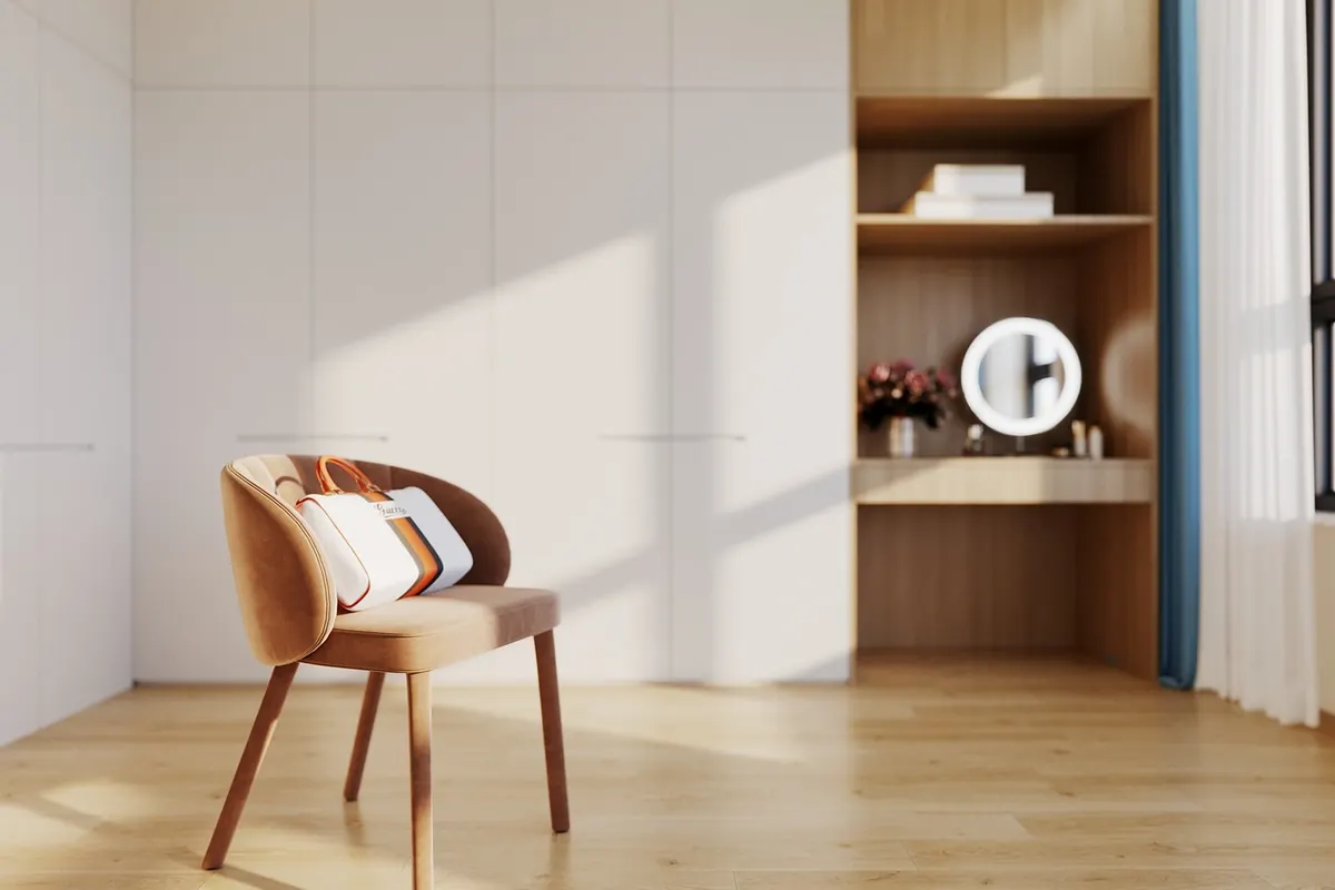
- Around 30 per cent — a mid tone. Bedding, curtains, headboard, an upholstered chair, the larger cushions. This is the sea and the shingle.
- Around 10 per cent — your deepest tone. A lamp base, a framed print, a small cushion, a metal handle. This is the dark line of the horizon.
Two details make a real difference. Paint the ceiling in the same white as the walls, or half-strength, so the junction disappears; if a north-facing ceiling looks grey, go a step lighter rather than adding blue. And consider painting skirting boards and door frames in the wall colour, in a harder-wearing finish — it looks calmer than a bright white outline around every surface.
Grey is the anchor, not the enemy
A coastal room without grey can feel insipid. Grey is what gives the pale tones something to sit against, and it is also what makes the blues look intentional rather than accidental. The trick is to match the temperature: a cool blue works with a cool grey, while sandy and oatmeal tones want a warmer, browner grey.
Test properly. Paint two coats onto A2 pieces of card rather than dabbing patches on the wall, then move them around the room at different times of day. Look at them at eight in the morning and again at nine at night with the lamps on. Blue-grey in particular can shift from soft to almost green under artificial light, and a colour that looks perfect in a sunny south-facing room can turn flat in a north-facing one.
Keep to one grey, or two at most. Three subtly different greys in one room reads as a mistake rather than a decision.
Let texture carry the scheme
When your colours are quiet, texture does the talking. A washed linen duvet, a chunky wool throw, a boucle cushion, a jute rug, an unglazed ceramic lamp base, a piece of driftwood-toned oak — these give the eye something to explore without adding a single new colour.
Two rules help. First, contrast matte with a little sheen: chalky walls against a slightly polished cotton, or a flat wool cushion next to linen. Second, keep metal finishes to one family. Mixing brass, chrome and black iron in a pale room looks busy very quickly.
Work with the light you actually have
British light is not generous, and it changes with the season. In a north-facing room, cool daylight will drag greyed blues towards grey-green, so tip the balance warmer: more oatmeal and sand, a slightly warmer white, and lamps with warm-white bulbs rather than cool ones. In a south-facing room, the opposite applies — the cooler blues and slates balance the golden light beautifully.
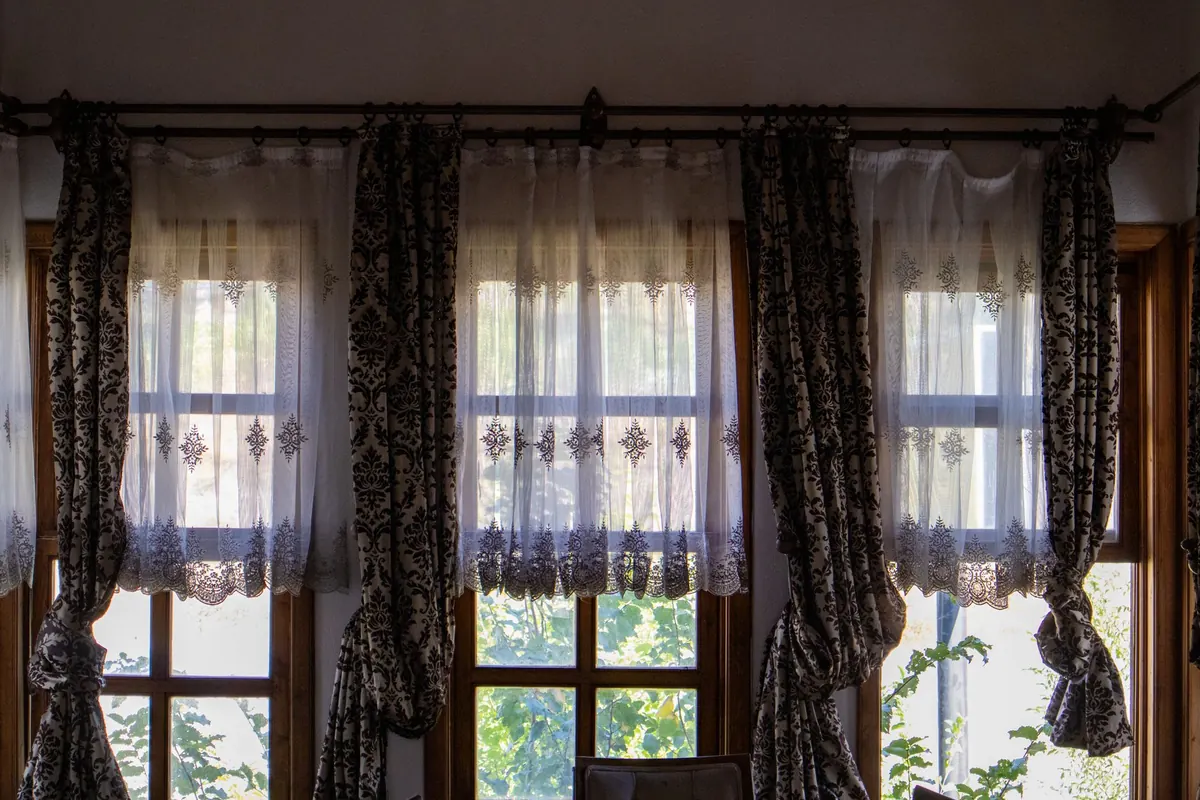
Layer your lighting rather than relying on a single ceiling fitting. Two bedside lamps on a dimmer, plus one lower light for the evening, will do more for the atmosphere than any paint colour. Lined curtains help too: they soften the light and stop the pale palette looking washed out at dusk.
A simple plan to start
If the whole idea feels like a lot, work in this order:
- Choose one coastline as your reference and pin a photo of it somewhere visible.
- Select four colours — one light, two mid, one deep — and write them down.
- Sample the paint on card and live with the samples for a fortnight before committing.
- Change bedding and curtains first. They are the largest areas of colour you can swap cheaply and without mess.
- Add texture gradually, one layer at a time, and stop when the room feels finished rather than filled.
Start with what you can change tonight: a linen duvet in a soft grey-blue, a wool throw in oatmeal, the lamp moved to a lower surface. The paint can wait until you are certain — and by then you will be choosing it for a room that already feels calm.
Photo: Andrea Davis / Pexels